A New Shop in 4 Weeks: Ermesponti ‘s designing and refurbishing of the Corneliani boutique in Florence.

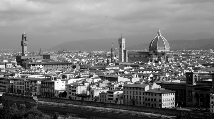
florence skylineAn important part of Ermesponti emerged in Florence.

Paolo and I studied architecture and married there. With notebook and pencil in our hands we learned the most important lessons directly from the buildings of Brunelleschi, Michelangelo and Leon Batista Alberti. Of course we studied all the fundamentals of the discipline through lectures and extensive reading but we discovered the essence of the art of architecture by drawing the buildings again and again. In this way we learned the strong bond between head and hands – architecture and craftsmanship – and we understood how important method is in the arts of the Renaissance.

Back in Mantua we began to run the old workshop of the Ponti family. We transformed it with a completely new approach which we appreciated from the Florentine workshops of the Renaissance. It was a lean approach to architectural interiors. We decided to call it Ermesponti’s “end-to-end” method, which starts from scratch and goes to completion. This became the key to completing a range of projects worldwide. (Please see poddaponti architetti website here).

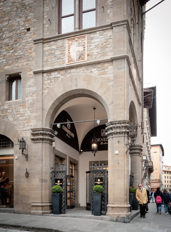
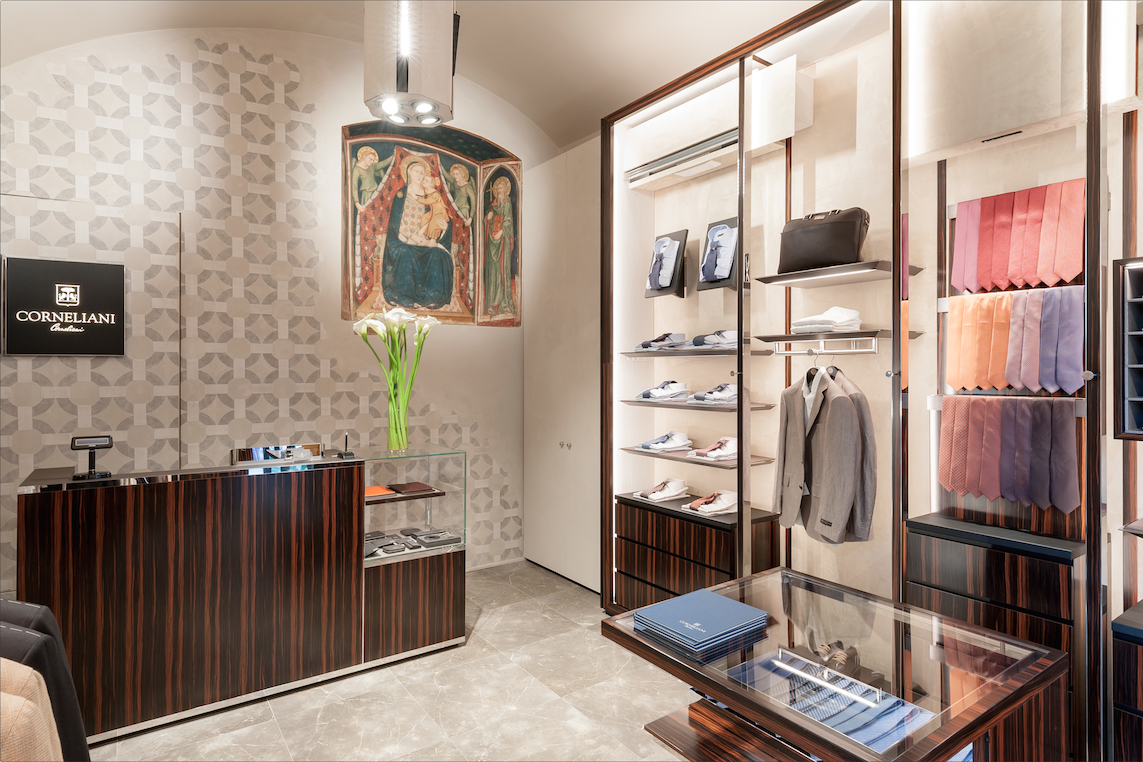
When we came back to Florence later with the task of refurbishing the old Corneliani boutique we were so enthusiastic to use our experience and method there. The location was so special as it was the Palazzo dell’Arte della Lana. It has such an important entrance hall from the Portico by Buontalenti and such an amazing fresco by Maestro del Bargello inside a niche on the ground floor. We immediately decided to apply the very first architectural rule we learned in Florence when we were students. We call it “Genius Loci” , which respects and highlights the character of the building. That’s the reason why here in Florence the Corneliani boutique retains the architectural features of this particular location. For example, the presence of the Florentine walls was completely respected and the displays reduced to a minimum. The colours of walls and other materials, like wood and marble, were given a slightly mat finish too.

portico

Actually the culture of Florence and Mantua came together. On the main wall of the ground floor we obtained permission not to obstruct the fresco as well as the wall. We also designed an understated 3D monochromatic pattern as a background which brings to mind the brand of the company. This pattern was inspired by the frescos of Andrea Mantegna found in the Camera degli Sposi in Palazzo Ducale, Mantua. The company logo was located intentionally in that corner in the manner of Brunelleschi’s details evident in Cappella Pazzi.

brand wall

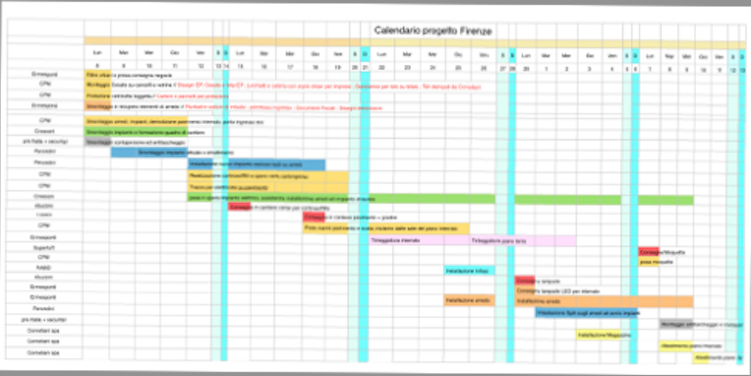
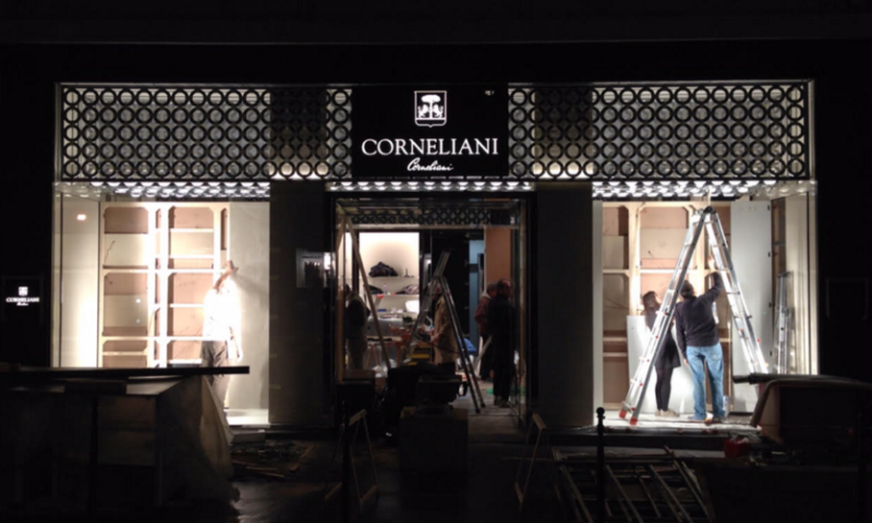
But our work as architects was not only concerned with design and architectural culture. Using Ermesponti’s end-to-end method, we were able to complete all the work on site in the space of five weeks. The director handed over the shop keys on February the 23. After demolition work , we organized everything from marble floors to ceilings and windows in a couple of weeks. Meanwhile we made bespoke furniture and installed it in one week while the electricians were finishing the Air Conditioning and lighting. We were able to give back the shop keys to the clients and open on the 12 of March 2016. That’s what we mean when we talk of a real turnkey project. ( Please have a look at the time schedule represented below).

time schedule

In the end we were so happy because the results exceeded our client’s expectations. We were also happy to bring back to Florence everything we had learned from the principles of architecture to the fine details of craftsmanship which is the essence of our Ermesponti’s approach to interiors.

Find out more on Ermesponti’s website.

A London bespoke interiors project by Ermesponti in Nightingale Lane – Part 3: the bookshelves and… the client’s feedback

Welcome to the third and last post of the series dedicated to the Nightingale Lane home in London.London bespoke interiors

After introducing you to the bespoke interior project we designed and realised for the kitchen and the living room, we will now tell you all about what we thought (and made) for the dining room and the sitting room.

And, as a final note, you’ll find the feedback the client generously shared with us. Enjoy!

  • THE BOOKSHELVES DIVIDING THE DINING ROOM FROM THE SITTING ROOM

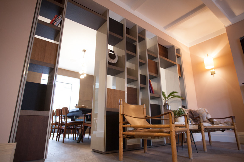
The bookshelves were definitely the main requirement of the project.

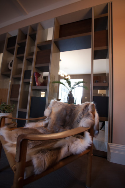
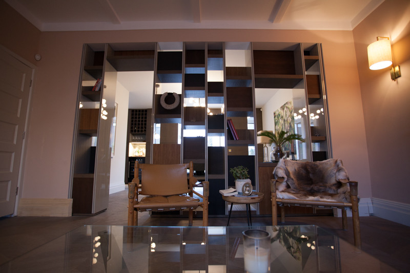
They are located between the new extension dining room and the old-style sitting room.  In fact they were supposed to divide and link the two parts of the house and at the same time to display many pieces of art, vases and books the owners collected over the years.

bespoke interiors in london

.
The inspirational idea was a pile of traveling trunks.

Each one was made of a different kind of oak -thermo-treated in three different tones – to remind the couple of their many travels.  

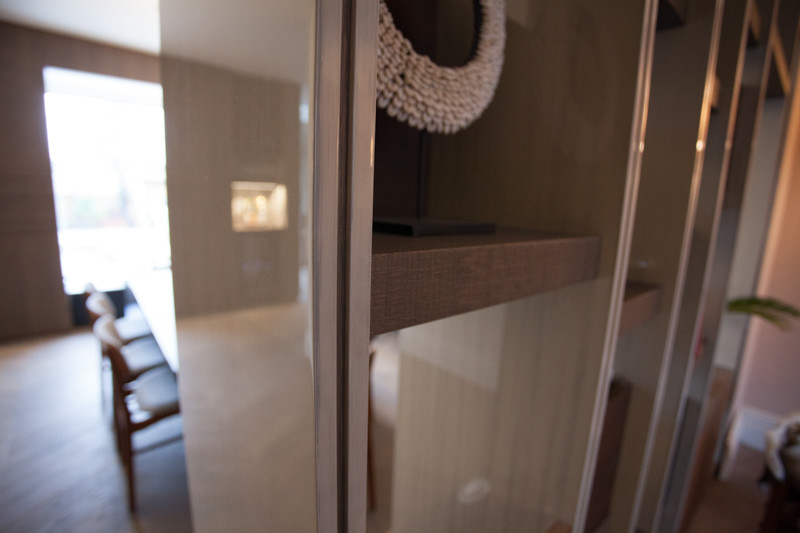
We conceived the bookshelves using thin, hand-lacquered sides and oak shelves randomly  positioned and overlooking the two rooms.

london bespoke interiors

The impression given is of a shifting cloud.

Each shelf acts as a tray and has its own back panel which serves as a backdrop.

FOTO NIGHTINGALE_LQ-12You can see between the  “L” shaped shelves in different directions through the empty spaces between them. This gives a dynamic effect with the hand -lacquered vertical risers.  
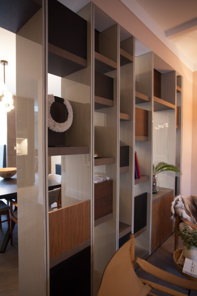
As requested, we designed a wider space so that from the dining table it is possible to see the original fireplace in the sitting room with a walk-in-passage on the  opposite side.

As an additional, we are glad to share a note we received from the client after completing the works: 

“We feel Ermes Ponti have provided vision, craftsmanship and quality far exceeding our expectation and for which we are very satisfied. For this reason, we will be more than pleased to recommend thi firm to our clients and others looking for similar quality.”

We thank our client for such a positive feedback, and we look forward to work for them again in the future, evolving the bespoke interior vision of their beautiful London home!

bespoke interiors in london

Nightingale Lane, London. A timeless bespoke interior project by Ermesponti – part 2: the living room.

Bespoke interior for a London home by Ermesponti

We have already shared  part 1 of the bespoke interior we recently designed and realised for a London home, including the whole residence, to harmonize the Arts-and-Crafts style of the house with the new extension in concrete, in the backyard.

While in the first post of this series we described the bespoke interior of the kitchen, today we get closer to a significant particular of the living room: the wall panelling for wine.
London Bespoke Interiors by Ermesponti

London Bespoke Interiors by Ermesponti

.

  • WALL PANELLING FOR WINE – PART OF THE BESPOKE INTERIOR FOR THE NIGHTINGALE LANE HOME IN LONDON

The young couple loves wine and they asked for a space where they can really enjoy this. 

We chose a dead corner between the kitchen and the dining room.

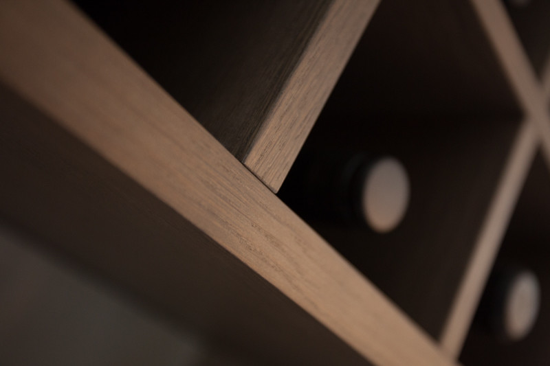
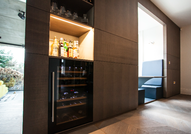
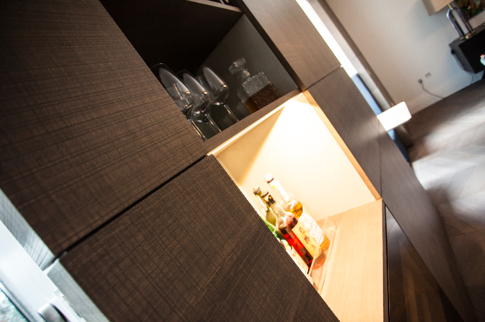
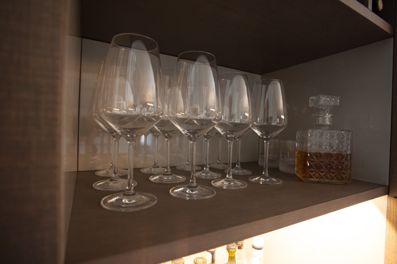
There we designed a hand-lacquered niche for the decanter and wine glasses with a wine cellar underneath and a  honeycomb effect made of solid wood for bottles above.

This niche was incorporated into  wall panelling made of engraved oak.  

Wine cellar handmade by Ermesponti

The lacquered  niche is prominent  and a wide horizontal strip emphasizes the grain in the wood.

A bespoke interior in London home by Ermesponti

  • Z AREA – PART OF THE BESPOKE INTERIOR FOR THE NIGHTINGALE LANE HOME IN LONDON

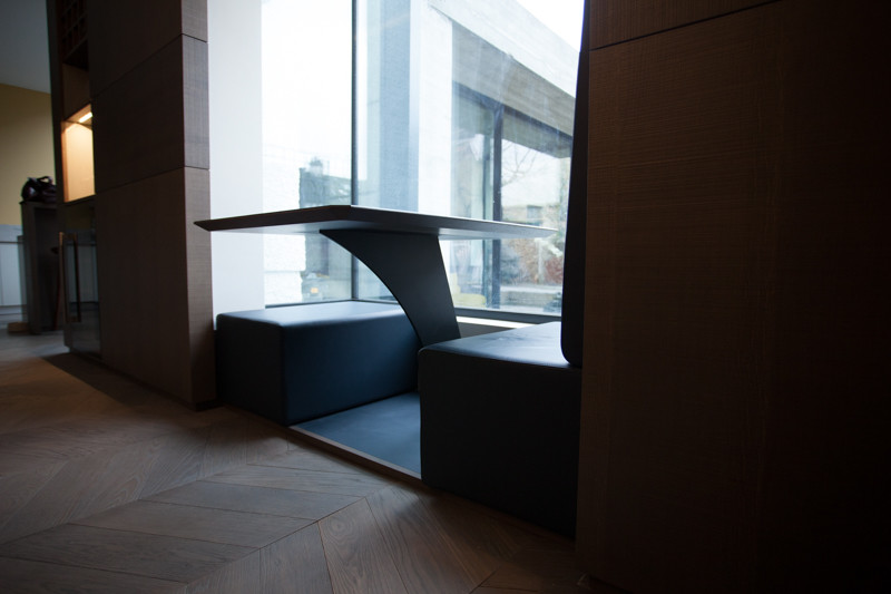
Inside the bay window we designed a cosy seating area with
asymmetrical leather chairs
and  a small  one-leg table in between.

The table top was of pure grain leather cut at an angle of 45 degrees.

We’ll share more soon about this bespoke interior project in London:  keep an eye on us!

Bespoke interior for a London home by Ermesponti

Table part of a London bispoke interior

London Design Week – The Ermesponti report.

  Schermata 2016-03-29 alle 17.16.52 .
Last week the London Design Week 2016 was on so we went to the Design Centre Chelsea Harbour in different occasions.

The Design Centre in Chelsea always tries to offer the latest directions in interior design and displays a good example of global names of the luxury interiors.

During this week, the place has been buzzing with people especially interior designers and – actually – if you are an interior designer or decorator, this is the place to come.

There are more than one hundred of shops offering materials and products (fabrics, carpets, wallpapers, trimmings, furniture and lightining) ready to be screened. Some products we saw were really inspiring and we found really close to what we think is beauty, unicity and luxury.

Among them, the trimmings by the Sevinch Passamanterie were beautiful pieces of art, handmade by artisans who master a very antique technique in making tassels and trimmings. This artefacts are so precious and unique, they are mainly produced for royal palaces and historycal houses (like The Wallace Collection Museum where we took pictures of few tassels weeks ago, without knowing where they came from!).

This year, the London Design Week also offered some brief insight from the hospitality world with two events.

We found very interesting the experience of Pasrichan Sharan, who took care of developing the Hoxton, well known place where-to-go in Shoreditch, especially among young professionals. The task of his team was to find the potential right location, to understand the right target and how to attract them.

The same task, although with a more ‘mature / high-end’ target, was undertook by another guest, Brian Clivaz in developing and managing an exclusive men’s club in Soho, the Arts Club.

The room they concentrated on was the main lounge area, the social space, where people come and gathered together. In both experiences (young professionals the first one, royalties and high society, the second) design plays a very important role. In order to create a smooth atmosphere, bespoke interiors with a few design pieces are used, some are vintage, in order to give a distinctive but recognizable character, a lifestyle, they are trying to sell to the customer.

Very interesting was also the meeting with Bernie Gallagher, chairman of the Doyle Collection, a family company, owner of eight boutique-hotels located in Ireland, England and US.

As they move to redesign and transform their hotels, the main thread for all of them was to deliver something “to be desirable and forever”.

For this long project, Bernie has been working with the architect Denis Looby from Sheehan & Barry Architects, met long time ago. Amazingly, every Doyle Collection Hotel is bespoke-designed, each with “a wholly individual look and feel”, combining fine architecture with elegant, modern interiors. I felt the views  this lady shared with us were really sensible and condivisible: a good manager spends with care, invests in the long run, has to aim high to be sure to deliver the best. We think they spotted it.

THINGS TO KNOW ABOUT ERMESPONTI BESPOKE INTERIORS IN LONDON:

1 – Ermesponti bespoke interiors has a London-based Export manager: to contact her is as easy as sending an email.

2 – Feel like checking out Ermesponti’s international references? Here you are!

3 – Ermesponti bespoke interiors has just completed a bespoke interior project in the heart of London.

Schermata 2016-03-29 alle 17.16.31

Schermata 2016-03-29 alle 17.16.37

Schermata 2016-03-29 alle 17.17.07

Nightingale Lane, London. A timeless bespoke interior project by Ermesponti – part 1: the kitchen.

Schermata 2016-03-24 alle 16.56.37

 Ermesponti has developed many projects in UK, with a special focus on London.

Recently, word of mouth and a mutual friend brought us in touch with a young couple.

Over drinks in a pub we chatted about their needs and showed them samples of our work and materials. They were most enthusiastic about the excellence of what we do. We soon felt they were on our wavelength and they engaged our services.

FullSizeRender (2)

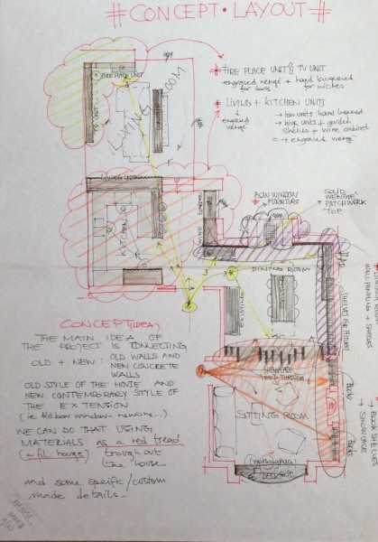
The Concept Layout

A second meeting, after a couple of weeks, involved us producing fresh samples and three-dimensional drawings of the project which now came to life.

They were keen to proceed immediately following rough details of budget and timescale.

A final meeting on site covered a thorough survey of the home and details of custom-made materials, final drawings and costs. Time was of the essence and it was crucial in the final agreement.

It took us just a week to finalise our production drawings, to order all the necessary materials and allocate the work to our craftsmen.

All in all, production in our workshop was finished in a fortnight.

Then our same craftsmen were able to install everything on site in the space of a week.

  • DESCRIPTION OF THE PROJECT

The main aim of the project was harmonizing the Arts-and Crafts style of the house and the new concrete extension on the backyard. We designed a timeless bespoke interior where the furniture is completely dovetailed to the architecture.

materials

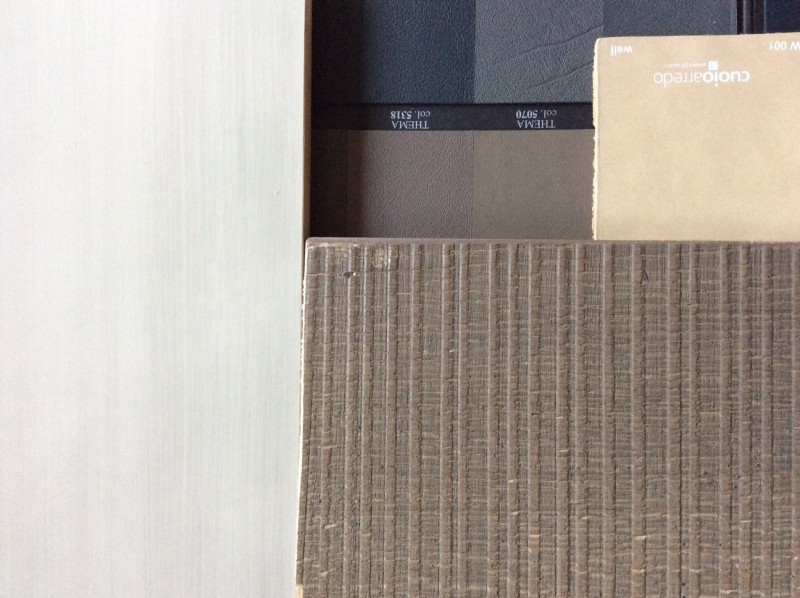
Palette of selected materials and colours


The project consists of three main parts: the kitchen with a special
cupboard overlooking the living room; the wall panelling  in the dining room with a small seating area inside the bow window and a niche for the wine in the corner; the bookshelves divide the dining from the sitting room.

Each part is different but related to the other and  you can easily find a common thread which gives harmony to the overall ground floor.

In line with the owners’ needs, we designed a unique interior using minimalist forms and custom-made materials. The subtle contrast between the different materials gives a sophisticated impression.

They are the perfect expression of Ermesponti craftsmanship that gives careful attention to each single detail.

  • THE KITCHEN

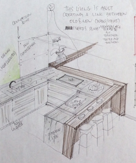
kitchen mini sketchThe owner loves cooking.
Her kitchen has been specially designed accordingly with a wide range of appliances and units.

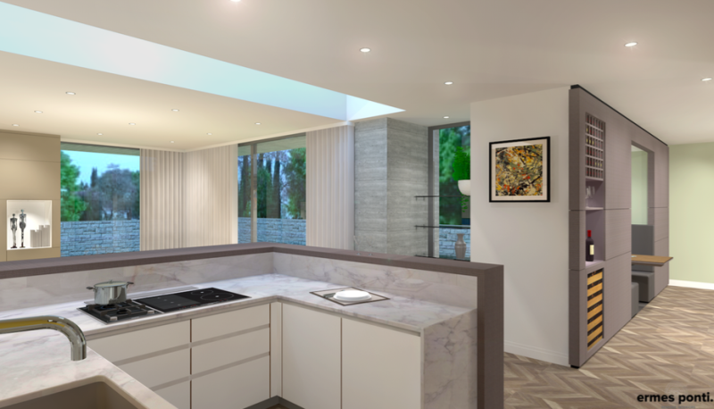
Each unit, for example, is made of marine plywood that is completely water resistant, is the highest quality and normally used just for yachts.

Schermata 2016-03-24 alle 14.18.35

The kitchen: the full-size render as we imagined it

FOTO NIGHTINGALE_LQ-80

The kitchen as we realised it, pretty much like we described it in our presentation

The texture of doors and drawers is engraved oak made just for the owners in our workshop, paying special attention to the tones of the varnishing.

So much care was devoted to every single wish or need of the owner.

A further example was the three pull out units to display such a collection of herbs and spices you can see in the following pictures: the end result met with her complete and full satisfaction.

.
kitchen PULL OUT

The pre-installation stage of the three pull out units in engraved oak (still to be varnished in the final colour)

.
FOTO NIGHTINGALE_HQ-50

The final result of the kitchen with the integrated pull out units, near the ovens

.Stay tuned for further updates on the Nightingale Lane home: coming soon, as soon as we get more pictures done!

London Calling… Italian Bespoke Design at the London Design Week 2016.

ChelseaLondonDesignWeek.
There’s a lot of talk, these day, in London about design, for the London Design Week taking place in Chelsea.

In particular, it seems like the home-extension market is having quite a development, due to an increase of taste for quality interiors among Londoners.

Well, being in London right now, developing several projects, we can witness that… yes, it’s true!

And it’s also absolutely true that the taste for exquisite Italian quality for bespoke interiors – and by that expression we mean “interior architecture projects uniquely and purposely designed for that specific use of that specific person” – has increased a lot.

As in every great city of the world – we feel at home in London, but we have worked quite a lot in other world capitals – we feel a growing demand for what is perceived as the ultimate luxury:

NOT the super-rich material or the overrated and hyperexpensive design piece, BUT the interior made just for oneself, in a single, custom realized piece noone else in the world will ever have.

We are used to say that our interiors are like portraits of the people that are designed and realized for…

A home, in our opinion, must speak the one and only language of the personality of its inhabitants, and our precise role as architects and interior designers is to understand, interpret and give back in terms of architecture and interiors such personality.

Noting more, nothing less… in London and anywhere else!

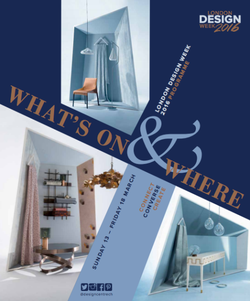
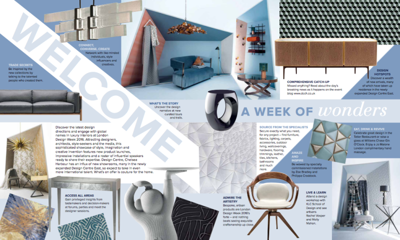
Download the Programme of the LondonDesignWeek 2016
.

LondonDesignWeek2016

Zaha Hadid won the Golden Medal. At Ermesponti we point out some common beliefs about interior architecture.

zaha-hadid

.
The news is out, and is a beautiful one:

Zaha Hadid won the Royal Gold Medal 2016 for Architecture, first women ever to win this prestigious prize.

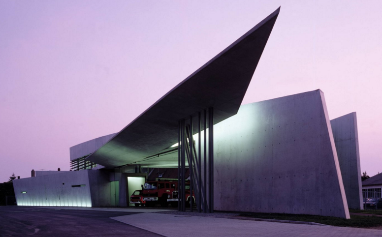
It was back in 1995 when we first saw a building by Zaha Hadid – her first – the famous Vitra House Fire Station.

We were studying architecture in Florence in those days and we were absolutely fascinated by the breaking-out of that architecture, totally and beautifully out of contest… what a sight!

And then, in the same location, amazing buildings by outstanding masters: Herzog & de Meuron’s VitraHaus showroom, the Vitra Design Museum by Frank Gehry and the conference hall by Tadao Ando…

vitra-house-fire station

Some twenty years later, the Baghdad-born architect wins the most important Arichitecture prize, the Gold Medal, personally approved by the Queen of England.

A few points that caught our attention, from her speech during the Award cerimony, and why we at Ermesponti feel particularly close to her and her views.

.
1.
” Part of architecture’s job is to make people feel good in the spaces where they live…”
.
Rightly so, the final aim of architecture is the internal space, and this is exactly our strong belief, too.
.
2.
“So we must be committed to raising standards of housing, schools and other vital public buildings…”
.
We like to think of architecture, rather than someone’s lifestyle expression, more as an active tool to raise quality standards, on a functional, structural, esthetical point of view… this was an idea of our master Gio Ponti and of course totally agree!
.
3.
“It’s a honour for me and my practice, but equally also for our clients.”
.
Which is to say that clients are included in the working team. When you are committed to design and realize a custom design and custom made architecture, the client is  in the middle of the creative process. Shall we say that at Ermesponti the client is always our paramount concern.
.
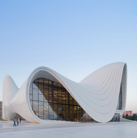
Feeling so near to Zaha’ views, it’s easy for us to dream for a moment, and imagine to be called by the Royal Gold Medal winner to realize the interiors of one of her outstanding building!

zaha-hadid-building-baku

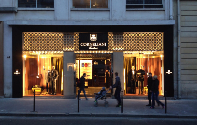
Ermesponti designs and realizes Corneliani’s Flasgship store in Paris, Avenue Georges V: a full expression of its end-to-end method.

A wonderful Christmas present for the Mantua-based Italian fashion brand Corneliani, who opens – during the Christmas season – its new Paris Flagship store, in the heart of the city.
We have had the pleasure to design and realize the store, a commitment which deeply involved us.
The project for the parisian flagship store is based on two principles – as it always happens with Ermesponti bespoke interiors approach.
.
First principle comes straight from the very own brand identity: let’s not forget we are speaking about a flagship store, which requires a full and adequate representation of the brand. The second principle is more an architectural one, and is all about putting the Corneliani brand into the right context: the center of the French capital, which, is of course, a place of immense and unique personality. Furthermore, the specific location is a rather important one, right in the middle of the fashion district – the “golden triangle” – between the Champs Elysées, Avenue Montaigne e Rue Georges V.

The challenge of designing and realizing the Corneliani Flagship store in Paris had two specific aspects: the emphasis on the brand identity, and the very special context of the city, accordingly to the “Genius Loci” principles.

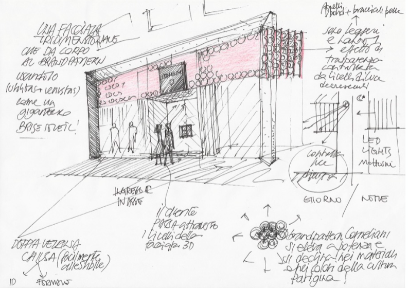
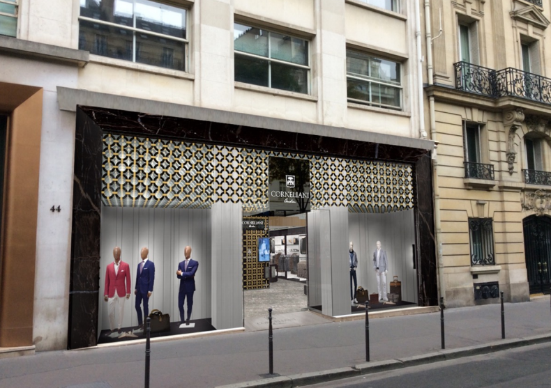
We have taken advantage from the façade, which – being the “face of the building” – has been designed by us to be a very special “filter” among the two strong personalities represented by the environment (city) and the brand (store).
Project for Corneliani Paris store
.
Corneliani Paris brise-soleil
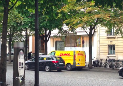
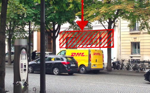
As you can see in these images, portraying the store before our work, the exceptional dimensions (4+ meters high) of the single window – entrance of the store – have suggested us to consider it and design it as a “façade in the façade”. A marble portal all around emphasizes – as with a frame – the “window on Paris” of the Mantua brand: almost a painting signed Corneliani.
Paris Corneliani Store project sketch by ermesponti
corneliani-ermesponti-interiors
Since the first time we visited the location, we have pinpointed the strong focus of the project, in terms of visibility. The higher part of the window-façade was actually a problem, both inside (with ceilings too high) and outside (with the need for a sunlight filter). On a functional level, a screen element was needed, something the Frenchmen call brise-soleil. 
.
Our choice has been to go for a functional solution that could be iconic as well… in this way.

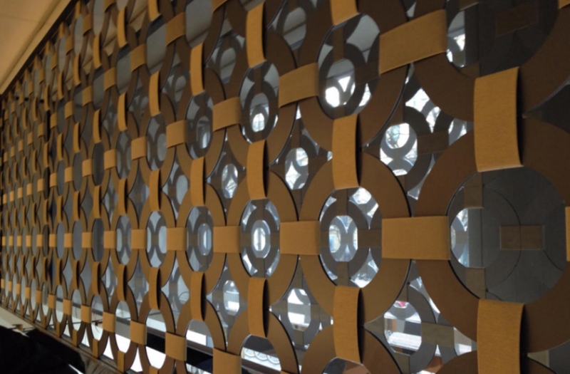
We have designed a sort of a “Corneliani Cloud”. A real, stratified cloud of Mantegna rings, which remind immediately of the Corneliani brand pattern, and of the beautiful cultural heritage of the city of Mantua, where the brand is based.

Corneliani-Parigi-ingresso


The corporate brand pattern is strongly emphasized and multiplied by 7 intersected layers of rings, well illuminated by LED light bars. In addition to all this, we have many more layers, for light distribution and fine control.

It took months and months of prototyping in Ermesponti bespoke interiors laboratories to test the lightest materials, the combinations and orientations of lights, and all the related details.

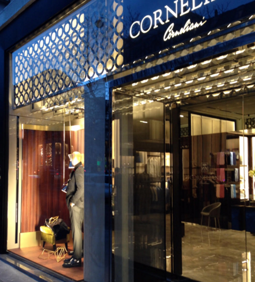
The window-façade becomes a tridimensional element, light, transparent and shiny, almost a membrane… you can compare it with some sort of filter (or fog as in Mantua?), not only to see through, but also… to walk through!
The rings have been realized with a brand new, very innovative and super-light material, made with an aluminum sandwich-structure (D-bond). The connections have been made with over 4,000 meters of tape, with a special golden-looking textile cover. (Everyone at Ermesponti bespoke interiors has done at least a couple of hundred meters…)..

The final effect makes you think of an update of the famous Parisian “grilles”, but also of the metallic structure of the French icon par excellence – the Eiffel Tower, or of some contemporary façade such as Jean Nouvel’s Arab World Institute.

As a result, the Italian Fashion brand’s presence in Paris is now a very recognizable one, and it expresses its powerful strength by means of its brand pattern, which roots itself in the Italian Rennaissance. And while doing so, Corneliani brings such an important heritage on a very familiar plan, close to everyone passing by in the street, fitting in very well in the Parisian sensibility and culture.
Corneliani-ingresso-ermesponti
.
And once he gets through the Mantegna cloud, the visitor finds himself inside the store, in a quadrangular hall (the long side of which is actually the façade) and quickly recognizes all the typical materials of the brand concept.
.
The floor is in grey imperial marble; the brand wall is covered with tiles of macassar ebony, basket-like intersected as in a precious textile; the logo is on a black carbon fiber plate. Recesses and boiserie in shiny ebony with a suede leather, light-coloured background are high and majestic and give some nice grand-style proportions to the hall.
This hall is dedicated to the top collection of the brand – ID – the modernity of which will be emphasized by every single detail of the showcase element. An example? The shelves in ebony with a linoleum top in mauve colour, worked at a 45° angle, with inox steel edge.
The cashier area is situated inside the shirt and accessory shop, well visible from the nearby entrance. The generous dressing room for this hall is aside, in the left corner.
Corneliani-parigi-dettaglio-ingresso
On the opposite part of the store, a side room with a lowered ceiling is an intermediate space towards the VIP Area in the back.
.
This part of the space has an irregular geometry, emphasized by  the recesses, dedicated to specific products: sweaters, ties, shoes, formal dress. On the background you can notice a recess dedicated to the bespoke collection by Corneliani, which is very high-profile and renowned, among the fashion savvy, the world over. A small desk has been provided for selected customers, to sit down and choose the fabric they prefer.
Corneliani-interior-design-notteCorneliani-Paris-Flagship-store

Christmas 2015: A Short Message for us?

ermes-ponti-christmas-wishes.
So it is Christmas again.
It happens once a year. Is it all about holidays, greetings and gifts? Is our Christmas in Europe or in western countries still genuine and credible?
.
This year we are wondering about the meaning of Christmas nowadays to give you a more real gift or send true greetings. Maybe the meaning of Christmas is simpler than we can imagine. It is just about God’s Son being on earth with us and for us. That makes sense. There is only one God and his Son came here just to tell us we are all brothers and sisters. That’s the message of Christmas!
.
If you just believe in this simple message, the New Year will be really new and happy.
It is not  only a  number on our calendar. A simple, humane idea can affect the world so your neighbour becomes you brother. How about behaving to him as you would like him to behave to you?
.
We wish you a new kind of Christmas and so  a real New Year.
If everyone of us lives in peace with his  neighbour, there will be no more war.
Let’s go for it. Two thousand years have gone by.  What are we waiting for?
ermes-ponti-xmas
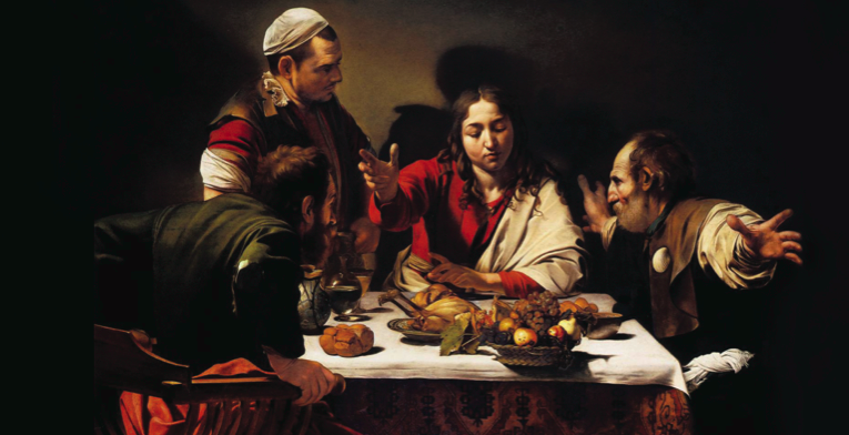
Image: “Supper in Emmaus”, 1601
Michelangelo Merisi da Caravaggio 
National Gallery, London

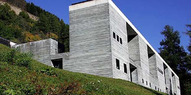
Peter Zumthor – an appealing holistic approach

Peter Zumthor from Ermes Ponti bespoke interiors blog.
A few years ago Peter Zumthor was awarded a Golden Medal by RIBA – Royal Institute of British Architects (Britain’s most prestigious prize for architecture).

By chance, I found on the Internet  the video of the lecture he gave in London for this occasion. I was so impressed by the similarities between his approach to architecture and ours that I cannot help talking about it… but first let me share the video of his speech.

The background
.
Peter Zumthor is the son of a cabinetmaker – like Paolo Ponti- and this could be the reason why both of them are so pragmatic and love materials rather than pure form. They are both architects by training and profession,  but in their blood there is still something about craftsmanship. Zumthor admits not being so concerned about Beauty (I mean the abstract architectural Beauty), but his work is more about “creating a space that is  just right for his purpose”. This has always been our first aim at PoddaPonti Architetti. Shall we say that function always comes first and beauty follows? (The rules of Vitruvius is all about this: Utilitas/Function + Firmitas/Permanence  = Venustas/ beauty).
.
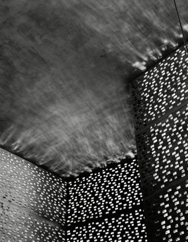
 peter zumthor on ermesponti blog
.
The project.
.
One of the dreams of Zumthor is to design “a house without a form”. He set up a project starting from the site and the brief. That’s exactly what we do at Poddaponti Architetti and at Ermesponti. Each project is always site-specific and custom-designed according to the exact needs of the client (we never forget the lesson of “Genius Loci”).
.
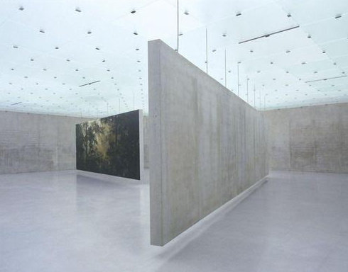
Zumthor work on ermesponti blog
.
The process.
.
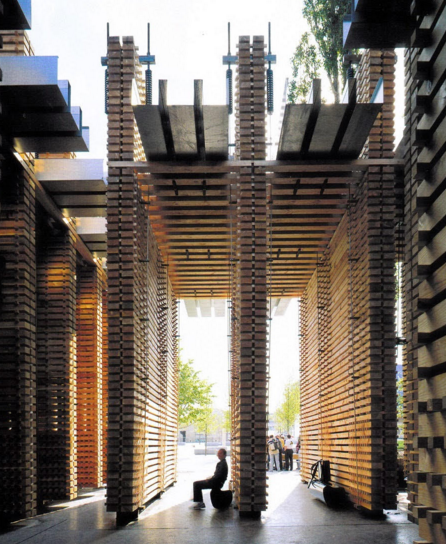
Zumthor defines his approach to the whole project as a “holistic process”– great expression!  We are not so keen on oriental language, but the concept we have in mind is exactly the same.works by peter zumthorAccording  to our cultural legacy,  we rather prefer to call it “end-to-end process”. In fact the cultural background of this approach is the Italian Bottega or handicraft workshop of the Renaissance and the theory of architecture described by Leon Battista Alberti, which is still unrivalled nowadays. ( Even the most famous  entrepreneur of today, Steve Jobs,  set up Apple using these ideas)
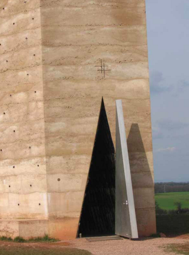
.
peter zumthor workThe client.
.
He declares:
.
…if someone wants a Zumthor building, that’s not my client! If someone wants a well-made building, that’s my client!
He also adds:
.
I am not a brand
We haven’t  the privilege of Peter Zumthor who can choose and sometimes refuse clients, but we are lucky enough because our clients choose Ermesponti for the same reason of top quality. If they want a custom-designed, custom-made, personalized interior, they call us!
.
The aim.peter zumthor works on ermesponti blog
.
The title of the lecture was ” Presence in Architecture”  and this theme seems to concern Peter Zumthor the most. We agree with him. We believe that architecture is about creating “a sense of space”, of interior space, which is able to make an immediate impression on people who walk there. Of course we do not have the same tasks and the same big project, but, like him, we always search for this “presence” in our small project.  We should call it the fifth dimension, He talks about the aim of experiencing real architecture which is like the experience of real music. There is a historic relationship between harmony in these two subjects. We totally agree.
.
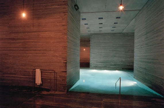
peter zumthor work: therme valsIn the end he compared ‘presence in architecture’ with the one we have in a pure landscape. He concluded the lecture with these last words:
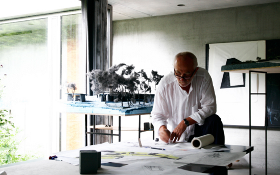
.

You know what I mean. You have a feeling. You are in the world, you are part of the world and there is something bigger than you

That’s a good point for creative people! We create pieces of architecture, art or music, but not the whole world! We invent using our hands and brain and the legacy of the past. With a sense of humility we should say…
.
We are all little beings!
peter zumthor on ermesponti bespoke interiors blog