Category Archives: Retail

London Design Week – The Ermesponti report.

  Schermata 2016-03-29 alle 17.16.52 .
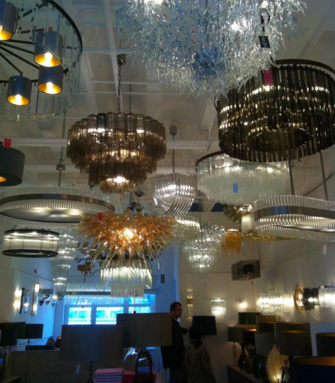
Last week the London Design Week 2016 was on so we went to the Design Centre Chelsea Harbour in different occasions.

The Design Centre in Chelsea always tries to offer the latest directions in interior design and displays a good example of global names of the luxury interiors.

During this week, the place has been buzzing with people especially interior designers and – actually – if you are an interior designer or decorator, this is the place to come.

There are more than one hundred of shops offering materials and products (fabrics, carpets, wallpapers, trimmings, furniture and lightining) ready to be screened. Some products we saw were really inspiring and we found really close to what we think is beauty, unicity and luxury.

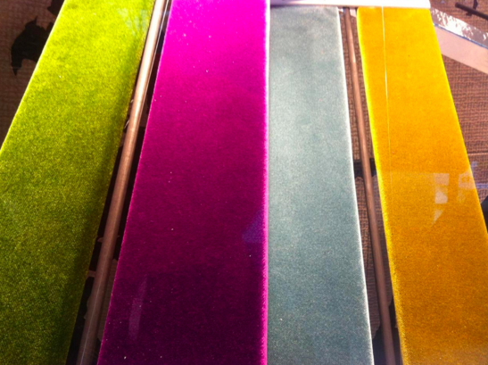
Among them, the trimmings by the Sevinch Passamanterie were beautiful pieces of art, handmade by artisans who master a very antique technique in making tassels and trimmings. This artefacts are so precious and unique, they are mainly produced for royal palaces and historycal houses (like The Wallace Collection Museum where we took pictures of few tassels weeks ago, without knowing where they came from!).

This year, the London Design Week also offered some brief insight from the hospitality world with two events.

We found very interesting the experience of Pasrichan Sharan, who took care of developing the Hoxton, well known place where-to-go in Shoreditch, especially among young professionals. The task of his team was to find the potential right location, to understand the right target and how to attract them.

The same task, although with a more ‘mature / high-end’ target, was undertook by another guest, Brian Clivaz in developing and managing an exclusive men’s club in Soho, the Arts Club.

The room they concentrated on was the main lounge area, the social space, where people come and gathered together. In both experiences (young professionals the first one, royalties and high society, the second) design plays a very important role. In order to create a smooth atmosphere, bespoke interiors with a few design pieces are used, some are vintage, in order to give a distinctive but recognizable character, a lifestyle, they are trying to sell to the customer.

Very interesting was also the meeting with Bernie Gallagher, chairman of the Doyle Collection, a family company, owner of eight boutique-hotels located in Ireland, England and US.

As they move to redesign and transform their hotels, the main thread for all of them was to deliver something “to be desirable and forever”.

For this long project, Bernie has been working with the architect Denis Looby from Sheehan & Barry Architects, met long time ago. Amazingly, every Doyle Collection Hotel is bespoke-designed, each with “a wholly individual look and feel”, combining fine architecture with elegant, modern interiors. I felt the views  this lady shared with us were really sensible and condivisible: a good manager spends with care, invests in the long run, has to aim high to be sure to deliver the best. We think they spotted it.

THINGS TO KNOW ABOUT ERMESPONTI BESPOKE INTERIORS IN LONDON:

1 – Ermesponti bespoke interiors has a London-based Export manager: to contact her is as easy as sending an email.

2 – Feel like checking out Ermesponti’s international references? Here you are!

3 – Ermesponti bespoke interiors has just completed a bespoke interior project in the heart of London.

Schermata 2016-03-29 alle 17.16.31

Schermata 2016-03-29 alle 17.16.37

Schermata 2016-03-29 alle 17.17.07

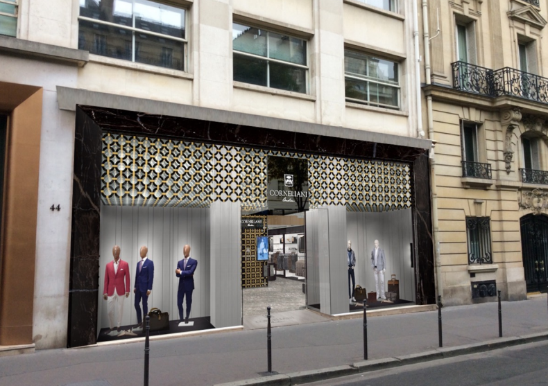
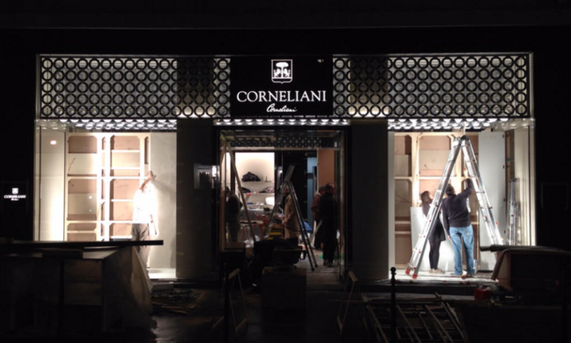
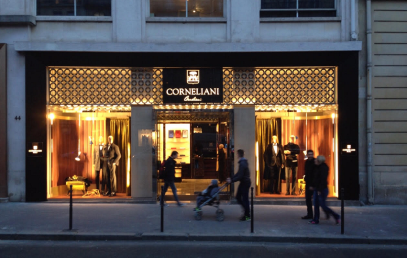
Ermesponti designs and realizes Corneliani’s Flasgship store in Paris, Avenue Georges V: a full expression of its end-to-end method.

A wonderful Christmas present for the Mantua-based Italian fashion brand Corneliani, who opens – during the Christmas season – its new Paris Flagship store, in the heart of the city.
We have had the pleasure to design and realize the store, a commitment which deeply involved us.
The project for the parisian flagship store is based on two principles – as it always happens with Ermesponti bespoke interiors approach.
.
First principle comes straight from the very own brand identity: let’s not forget we are speaking about a flagship store, which requires a full and adequate representation of the brand. The second principle is more an architectural one, and is all about putting the Corneliani brand into the right context: the center of the French capital, which, is of course, a place of immense and unique personality. Furthermore, the specific location is a rather important one, right in the middle of the fashion district – the “golden triangle” – between the Champs Elysées, Avenue Montaigne e Rue Georges V.

The challenge of designing and realizing the Corneliani Flagship store in Paris had two specific aspects: the emphasis on the brand identity, and the very special context of the city, accordingly to the “Genius Loci” principles.

We have taken advantage from the façade, which – being the “face of the building” – has been designed by us to be a very special “filter” among the two strong personalities represented by the environment (city) and the brand (store).
Project for Corneliani Paris store
.
Corneliani Paris brise-soleil
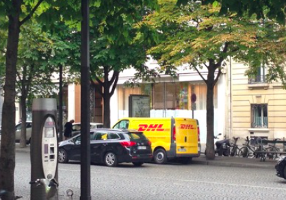
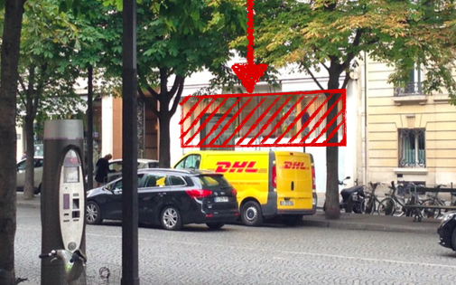
As you can see in these images, portraying the store before our work, the exceptional dimensions (4+ meters high) of the single window – entrance of the store – have suggested us to consider it and design it as a “façade in the façade”. A marble portal all around emphasizes – as with a frame – the “window on Paris” of the Mantua brand: almost a painting signed Corneliani.
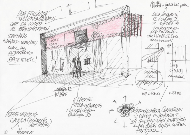
Paris Corneliani Store project sketch by ermesponti
corneliani-ermesponti-interiors
Since the first time we visited the location, we have pinpointed the strong focus of the project, in terms of visibility. The higher part of the window-façade was actually a problem, both inside (with ceilings too high) and outside (with the need for a sunlight filter). On a functional level, a screen element was needed, something the Frenchmen call brise-soleil. 
.
Our choice has been to go for a functional solution that could be iconic as well… in this way.

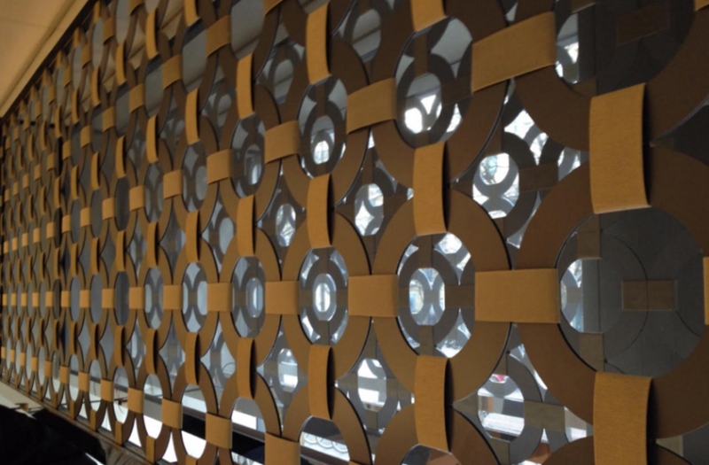
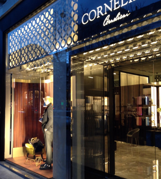
We have designed a sort of a “Corneliani Cloud”. A real, stratified cloud of Mantegna rings, which remind immediately of the Corneliani brand pattern, and of the beautiful cultural heritage of the city of Mantua, where the brand is based.

Corneliani-Parigi-ingresso


The corporate brand pattern is strongly emphasized and multiplied by 7 intersected layers of rings, well illuminated by LED light bars. In addition to all this, we have many more layers, for light distribution and fine control.

It took months and months of prototyping in Ermesponti bespoke interiors laboratories to test the lightest materials, the combinations and orientations of lights, and all the related details.

The window-façade becomes a tridimensional element, light, transparent and shiny, almost a membrane… you can compare it with some sort of filter (or fog as in Mantua?), not only to see through, but also… to walk through!
The rings have been realized with a brand new, very innovative and super-light material, made with an aluminum sandwich-structure (D-bond). The connections have been made with over 4,000 meters of tape, with a special golden-looking textile cover. (Everyone at Ermesponti bespoke interiors has done at least a couple of hundred meters…)..

The final effect makes you think of an update of the famous Parisian “grilles”, but also of the metallic structure of the French icon par excellence – the Eiffel Tower, or of some contemporary façade such as Jean Nouvel’s Arab World Institute.

As a result, the Italian Fashion brand’s presence in Paris is now a very recognizable one, and it expresses its powerful strength by means of its brand pattern, which roots itself in the Italian Rennaissance. And while doing so, Corneliani brings such an important heritage on a very familiar plan, close to everyone passing by in the street, fitting in very well in the Parisian sensibility and culture.
Corneliani-ingresso-ermesponti
.
And once he gets through the Mantegna cloud, the visitor finds himself inside the store, in a quadrangular hall (the long side of which is actually the façade) and quickly recognizes all the typical materials of the brand concept.
.
The floor is in grey imperial marble; the brand wall is covered with tiles of macassar ebony, basket-like intersected as in a precious textile; the logo is on a black carbon fiber plate. Recesses and boiserie in shiny ebony with a suede leather, light-coloured background are high and majestic and give some nice grand-style proportions to the hall.
This hall is dedicated to the top collection of the brand – ID – the modernity of which will be emphasized by every single detail of the showcase element. An example? The shelves in ebony with a linoleum top in mauve colour, worked at a 45° angle, with inox steel edge.
The cashier area is situated inside the shirt and accessory shop, well visible from the nearby entrance. The generous dressing room for this hall is aside, in the left corner.
Corneliani-parigi-dettaglio-ingresso
On the opposite part of the store, a side room with a lowered ceiling is an intermediate space towards the VIP Area in the back.
.
This part of the space has an irregular geometry, emphasized by  the recesses, dedicated to specific products: sweaters, ties, shoes, formal dress. On the background you can notice a recess dedicated to the bespoke collection by Corneliani, which is very high-profile and renowned, among the fashion savvy, the world over. A small desk has been provided for selected customers, to sit down and choose the fabric they prefer.
Corneliani-interior-design-notteCorneliani-Paris-Flagship-store

Almaty, Kazakhstan: retail interiors for Baby Juniors. Warm Italian atmosphere in the mall frenzy.

Baby Juniors - Interiors by ermesponti

Imagine a store for children in a great, crowded, brand new shopping centre.

Imagine to create a cozy and intimate atmosphere to make your little customers comfortable.

Imagine to be able to suggest the quality of the Italian lifestyle: Made in Italy in the air, on the walls, in the lights… in the general atmosphere.

Now, watch this become real, thanks to a 100% custom designed, Made in Italy project by ermesponti.

Italian atmosphere? Just ask!

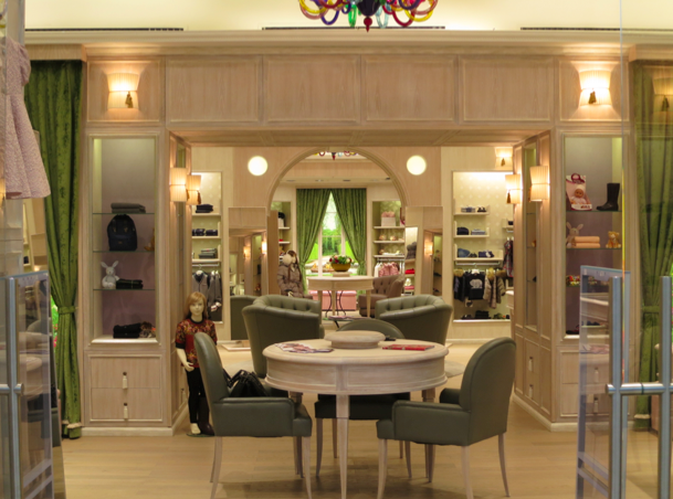
In order to make such a dream come true, Poddaponti architetti had, in the first place, the idea of creating a scene from an historic Italian palace.

In fact, entering the store you get the feeling of being inside a Renaissance Baby Juniors - Interiors by ermespontipalace, with three rooms communicating with each other, open to imaginary Italian gardens you can stare at thanks to some stunning photos mounted on light boxes (mounted so accurately that actually customer happen to try to open the fake window).
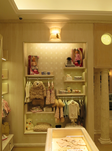
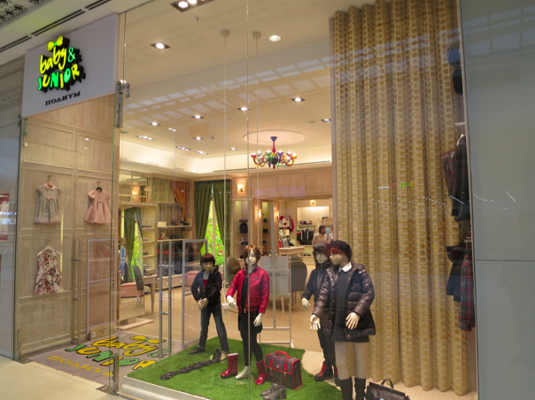
The proportions, the choices of materials and furnishings, the whole project give such a feeling of spaciousness… you can forget about the crowded and chaotic mall.

Once inside, you can find the Italy of Palladio.

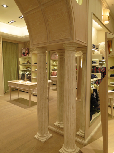
The interiors – various rooms charachterized by niches and coordinated lockers – the large bow window at the very end,  the serliana solid oak with a pickled effect… all this speaks a precise language.

The language of these environments is – no doubt about – Italian.

The Italian language of architectural tradition, and perfectly-made interiors.

You can indeed find, in this Kazakhstan shop, the Palladian proportions (in the serliana) and the typical artisan care for details only Italians are able to produce, plus – finally – the look + feel of the fashion products available in the shop: all Italian brands!

Made in Italy as user experience.

From the first look you have at the interiors, when you step in to the feeling of well-being that comes by walking around…
Baby Juniors - Interiors by ermesponti
the whole store can be defined as a true Made in Italy Experience.

In there, everything is 100% custom designed in Italy.

Among the contributors to the realisation of this retail shop: Berto Salotti for sofas, Dedar Milano for curtains and wallpapers in the bottom of the niches and also a small artisan of Murano for the stained glass blown chandelier.

And the brands represented in the store, of course,  convey the glamour of the Made in Italy fashion taste: ArmaniJunior, Dolce & Gabbana, GF Ferrè, Missoni, Monnalisa, Versace Boys

Designed in Italy = Value for money.

The designed in Italy, as we do in ermesponti, shows an extraordinary value for quality-time-cost, unbeatable for this quality.

What is often considered an unattainable luxury – bespoken or tailored interiors for instance – is not necessarily costly.

Our end-to-end approach maximizes every element of the design and construction process, keeping everything under control.

In other words: quality at the highest levels ever and short design/production process.

The qualitative results and economic are amazing, in Almaty as in New York or Mantua or… your place, wherever it is :-)

Baby Juniors - Interiors by ermesponti

[Photo gallery + video] The new Corneliani’s extension in via Montenapoleone, Milan

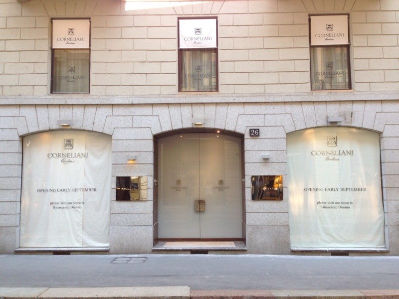
How did you spent your summer holidays? Seaside or mountains? We chose Milan, Via Montenapoleone. We only had month to do all the site works – furnishings included – for the opening of the new additional wing of the Corneliani’s boutique in Milan fashion high street (btw, the PoddaPontiArchitetti Studio mentioned on Corneliani’s website is… us: an architect firm within a handicraft workshop). 1-foto iniziale During the last week of July we gradually removed the fittings and demolished the wall to open and enlarge the ground floor space on the right side of the entrance. We did a thorough survey and started the furniture production. In the meanwhile, we organized the works on site from floor to ceilings, from lighting to plants. On August 22nd everything was ready to start the installation of our furnishing.

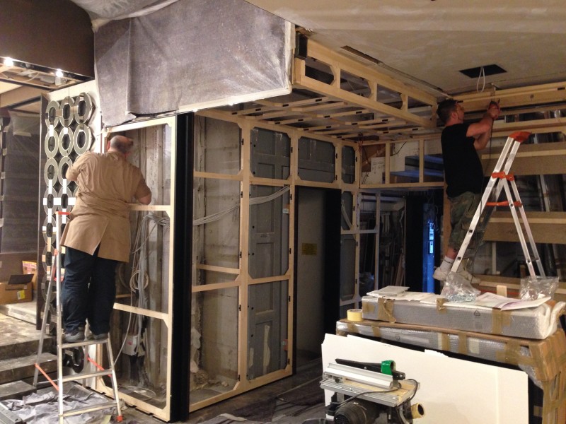
You’d never guess how difficult it can be to work together – bricklayers, plumbers, electricians and carpenters – in such a small room… But as we accepted the project, we knew perfectly how things should have been done.

panoramica alberto scala Despite all the problems of the site – including the problematic height of the stairs – we  were finally able to fit everything in a perfect way. All the cables behind the wall panelings, the air conditioning diffusers perfectly aligned with the ceilings and the furniture, impressive handmade wooden details on the new brand wall… dettaglio
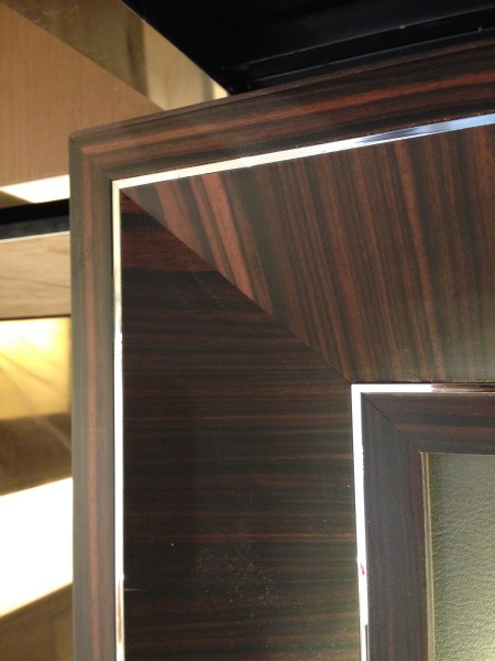
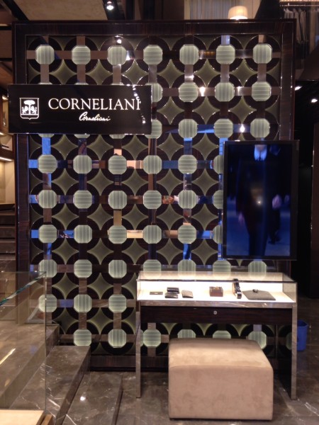
Have you seen the brand wall, do you recognize it ? We designed this pattern for the first time for the facade of the Corneliani flagship in Shanghai reinventing it from the famous Mantegna‘s fresco of the “Camera degli Sposi” at Palazzo Ducale in Mantua.

After that, Corneliani decided to use it in his next winter collection and soon it became the new Corneliani brand pattern, also for the strong bond with the cultural heritage of Mantua, where the company is located. In Milan, you can find the brand wall in front of the entrance doors. It is built by backlit ebony circles and iron bracelets fixed on a chessboard of leather panels decorated by special drawstrings sewed on its backside (produced by our friend Berto Salotti in record time for us!). Please take a look at the impressive details of the ebony frame junction: we must thank our master carpenter Alberto for making them with such a loving care! brand wall The opening day was scheduled for the first week of September, but we were ready almost a week ahead! The Corneliani Creative Director – Mr. Sergio Corneliani in person – opened the doors of his renovated Montenapoleone store on Monday September 1st and, while doing so, was perfectly aware about the key figure to credit for such a perfect job: his trustworthy architect Paolo Ponti! foto finale
“God is in details”… maybe even in the details of the work of our artisans

Listening to the sayings, many things are hidden into details.

We are talking about the more or less common proverbs “the devil is in details” (of uncertain origin, it seems the favourite motto for a pop musician), “God is in details” (attributed to Mies Van der Rohe, but also Gustave Flaubert and Michealangelo), “difference is in details”, “beauty is in details” and so on.

In Ermes Ponti, what we put in details is certainly a remarkable amount of effort and attention.

We are real maniacs for details as we believe that the beauty and the validity of the whole – of an environment as of an object – is the sum of many harmonic perfect details.

Some examples?

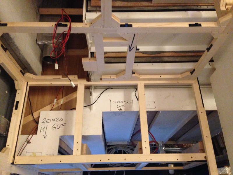
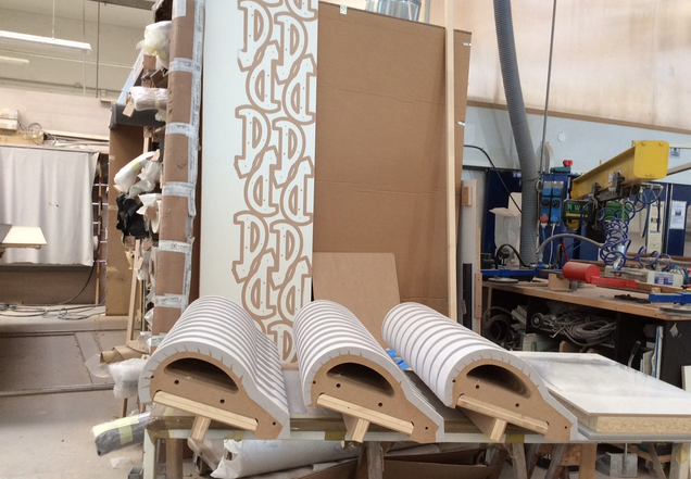
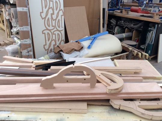
The panel below is a “martyr” panel, used to hold another panel which has to be shaped by the numerical control machine.

The “P” is then coated in clear micro fiber and matched to form the accessory that holds belts in a men’s fashion boutique.

Ermes Ponti bespoke interiors

ermes ponti retail design

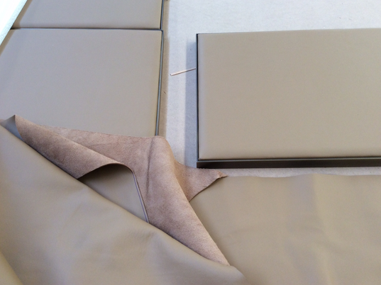
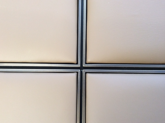
Another one: this wall paneling with stylish frames in burnished brass will frame mirrors leather-covered… because Ermes Ponti not only works with wood, but also with high quality leather!

ermes-ponti-bespoke-interiors-1

ermes ponti leather paneling

One more, the closeness between the design stage and the production stage enables some creative sparks like this. Do you like it?

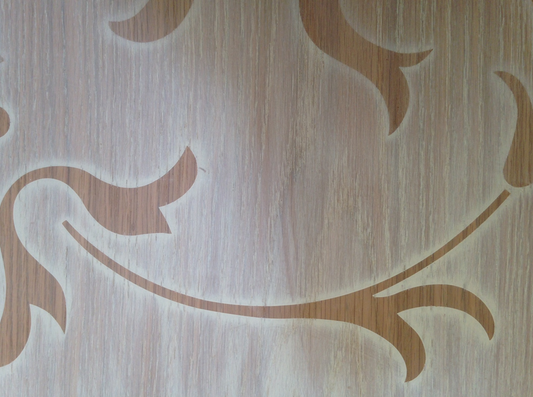
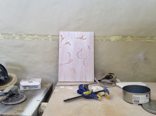
It’s a tattoo on wood, we called it Wood Tattoo and it’s a creation as part of a “business” work, the interior design is our brand for a retail fashion industry.

It’s an oak wood on which it’s apllied an adhesive before being finally treated with a pickeld effect.

So, when we say “end to end process”, it’s not theory, but daily practice! Even better, it’s the Ponti method.

Tatuaggio su legno, by ermes ponti

lavoro artigiano by ermes ponti: tatuaggio su legno


Our company bears this man’s name. An interview with Mr. Ermes Ponti.

We start today an open conversation with Mr. Ermes Ponti, the man whose name is also the company name.

His presence is always discreet, but nevertheless clearly perceived, more through actions than words, especially towards the young people in our company.Mr Ermes Ponti, of Ermes Ponti bespoke interiors (Italy)

For whoever works in the manufacturing industry, as we do, the generations who opened the way to our crafting activities are a constant reminder of technical abilities and approach to entrepreneurship, elements of our everyday life.

But now let’s hear from Mr. Ermes Ponti.

– Mr. Ermes, how did the company begin its activity?

Ermes Ponti – 

 – It all started on the banks of the Po river, in a small town right outside Mantua, San Giacomo Po.

At the end of the ’30s, my father bought the first machines to start a carpenter shop; the story goes that he rode his bicycle to Milan, and when the trucks with the machinery arrived in our village everyone came out of their homes, thinking the new bells for the church had arrived!

 – How did the carpenter shop grow, later on?

Ermes Ponti – A few years after the end of the war , the shop moved to San Biagio, where we are now, inside an old power powerhouse. We were an industrial company at that point, many people knew us for the modern furniture we would propose, something none around here did at the time.

Mr Ermes Ponti, of Ermes Ponti end-to-end interiors (Mantua - Italy)In 1957 we have been the first ones in Italy to be able to put polyester paint on furniture, getting the idea from a car hood someone showed us.

On April 12th – I still remember the exact date – we showed it at the Milan Fair, and it was a huge success. For many years after that we developed projects derived from the new polyester paint, which is still in use, by the way.

When the ’60s came by, it came my time to join the family company.

We decided to call a great architect, someone who could design new collections for us. I sat down with my wife Gabriella – to whom the Gabriella chair is dedicated – and wrote a letter to Mr. Gio Ponti, with whom we started immediately a long collaboration.

Mr. Gio Ponti designed for us a brand new furniture collection, based on an innovative home concept: the Apta series.

Unforgettable times: Gio Ponti has been for me a true role model.

– When did the company the company headquarters took the actual shape?

Ermes Ponti – It was in the ’70s, when we broadened the premises and built the actual laboratory; in that period we got important assignments, mostly very big hotels and private villas.

– With which important brands did you get involved?

Ermes Ponti – We worked with many, crafting high quality pieces designed by the most famous architects, one name for all: Driade.

–  Does this mean you specialized in design?

Not really, we specialized in… well done jobs.

Later on – mid ‘ 90s – we got in touch with the fashion industry, with the MonteNapoleone Corneliani boutique, in Milan.

After my son Paolo and his wife Daniela, both graduated in Architecture in Florence, joined the company, Corneliani offered us the chance to work on the first projects of integrated design; initially a small showroom in Paris, then a boutique in Russia, and so on… until they decided to rely on us for the entire London New Bond Street project, and Milan Montenapoleone project.

To this date we have realized over 50 Corneliani shops all over the world.

– In the recent years, which have been the main projects?

In the last ten years we have worked mainly with fashion industry, designing and building great flagship stores, both mono-brand and multi-brand, worldwide.

The whole process – from the very first idea to the turnkey realization – is managed by us, and guarantees the client a constant reduction of resources employed, optimizing the whole project in terms of:

  • functionality
  • architectural aesthetics
  • handicraft furniture quality (drawings, samples etc.)

Thanks to this new integrated method of design and building, we have acquired important assignments in luxury retail and top brand yachting.

– The yachting industry: everybody says that it has been hit badly by the economic crisis…

Ermes Ponti – It’s true, but – as strange as it may seem – the hard times have pushed many people towards our company.

When we approached this industry, a few years ago, the crisis was already at its worst… but our method helped reduce consistently the resources needed to complete a project.

For instance, we have been able to cut by 50% the delivery schedule of a 94-feet boat, by reinterpreting the drawings and optimizing the building times.

– Crisis as opportunity, then?

Ermes Ponti – The crisis has taught a lot to us.

It asked us to evolve, by diminuishing time and costs, and increase quality.

My son Paolo has been working in this direction for 10 years now, putting into practice many equally important elements: his architectural culture, his practical and organizational intelligence, the passion for his work, the commitment to his community, the daily sacrifice.

I think that these are the values of the “small” Italian companies, something that have made “great” the Made in Italy in the world.

Personally, I think that such values are still relevant, and maybe the economic crisis has helped us to re-discover them.